Psychology - Communication
Overview
Each week for our psychology course, we were placed in groups of about 4-5 students and were assigned a product that we must design while taking into account the subject of the week in mind. When the topic was communication, we were tasked with creating several merch products that not only educating its viewers but also incorporates a design aspect to it, while making it interactive.
Roles
My role, just like my teammates, was to design merch that were both useful and visual pleasing.
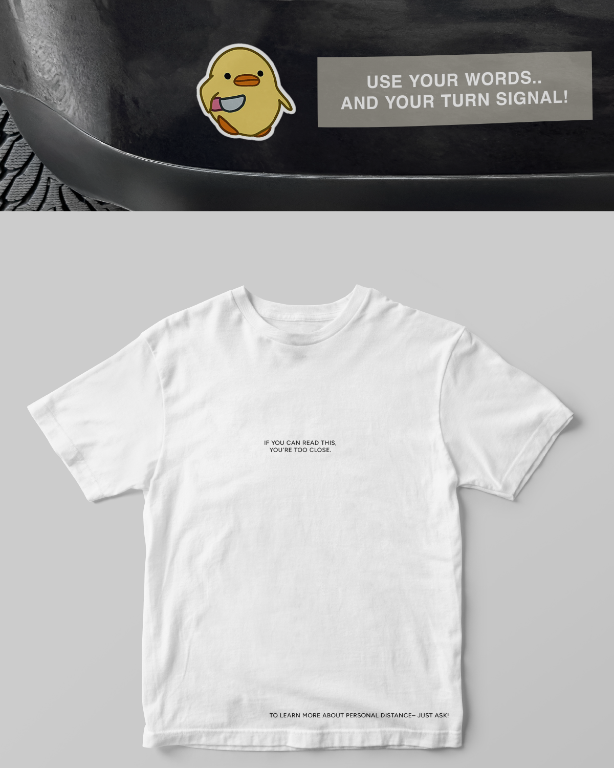
- I designed the bumper sticker and the t-shirt.
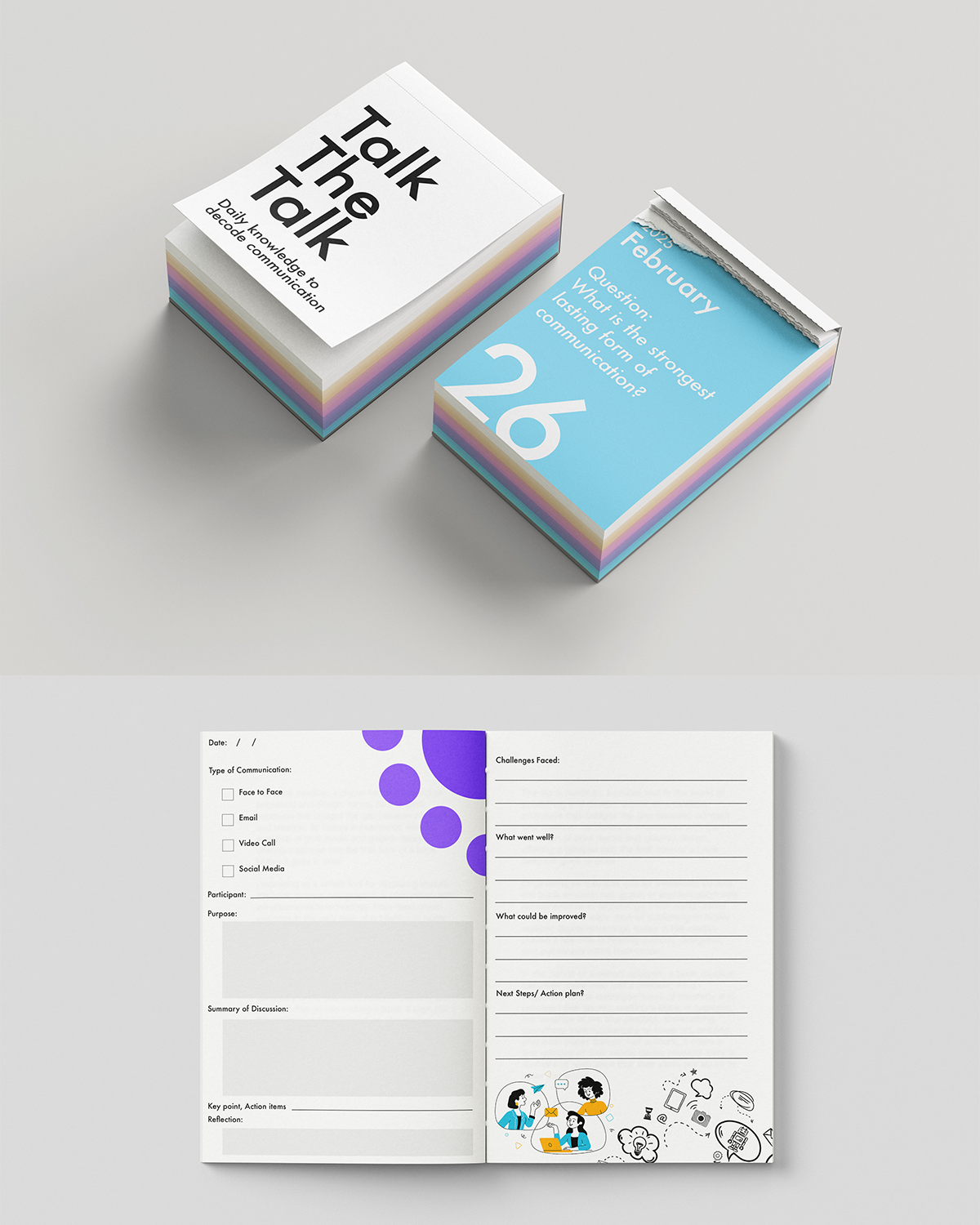
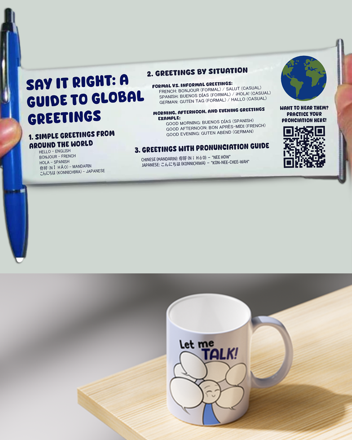
- My teammates' merch designs included: a mug, a journal, a calendar and a pen.
Challenges
The challenges were composed of the following:
- coming up with several creative merch ideas that are on theme with communications
- designing while incorporating the three aspects (learning, interactive & design) at the same time
- making sure that the merch products and designs actually entice people to purchase them
Solutions
Methods we used:
- get some inspiration from pinterest / web
- assign an equitable amount of merch for each member to design
- discuss among us, which led to us brainstorming as a group (even if the tasks were divided)
- ask the teacher for some indicators / suggestions for ideas
Process
My design process is composed of the following steps:
- go over the powerpoint slides that discuss communications
- research on the educational information that should be detailed
- brainstorm merch product ideas that are both realistic and useful
- reflect on ways to design the merch while centering them on the theme
- ensuring that each merch product incorporates the three aspects (learning, design, interactive)
Results
After hearing our teacher's advice, we decided to design according to her suggestions and also improved upon our first round of drafts (following her review and feedback).
For my t-shirt design, she appreciated how minimalist and simple it was– as it still managed to convey information pertaining to communications while adding some humour to it. It reads: "If you can read this, you're too close." referring to personal space and on the bottom of the shirt, a link/qr code to inform viewers on the topic. As a result, this design was approved on the first round.
As for my bumper sticker design, she said that the text on it saying "Use your words & your turn signal!" did not appear to be logical– in the sense where using words to communicate instead of reacting with anger when driving on the road is not as simple as it seems. In terms of the design, she liked the cute duck as it was meant for viewers to understand the message while not taking it offensively.For the second round of drafts, I kept the same design but replaced the text with "Back off! Personal space also includes my bumper."
Key Learnings
From this project, I learned to explore my creativity and design related to a very specific subject– not just any topic, one that is more informative and education-based. Prior to this course and this project, I hadn't ever designed something that had these types of constraints, especially in an academic setting.
Personal Project
Overview
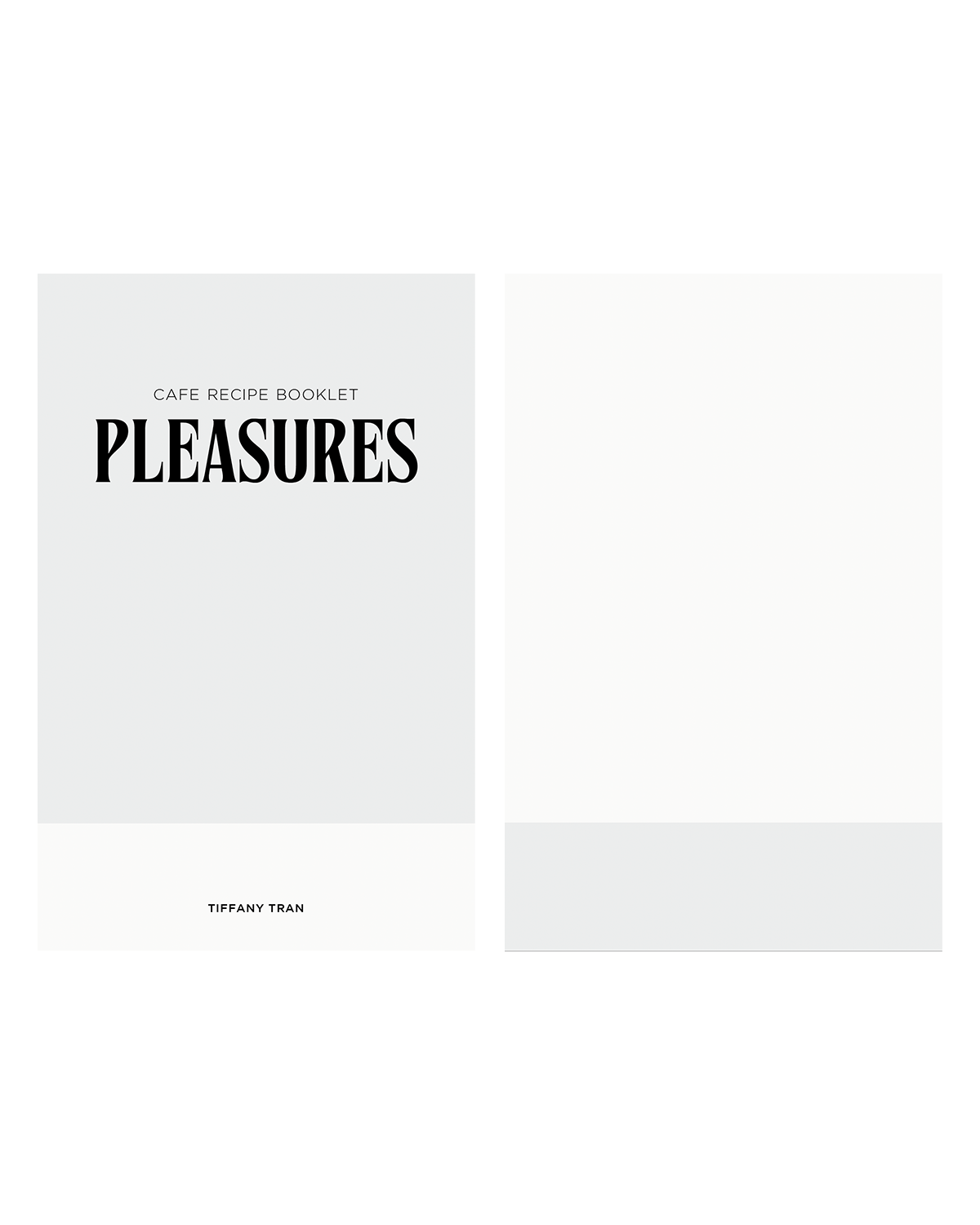
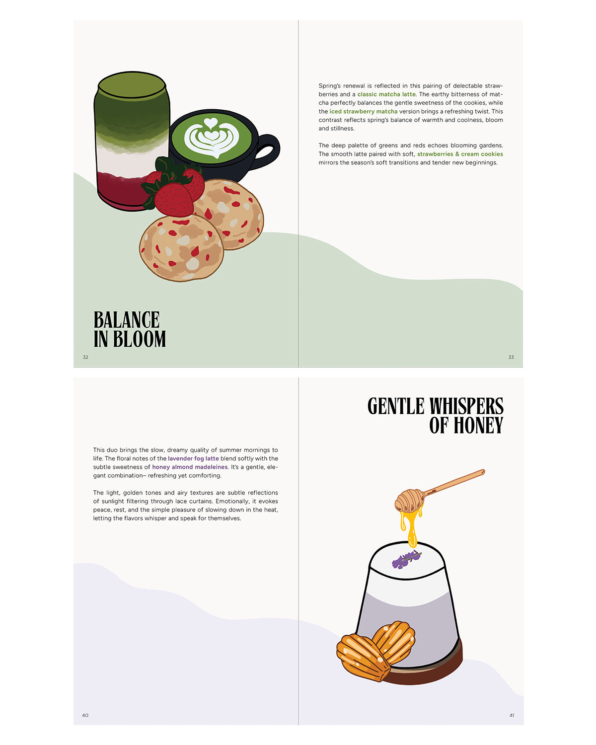
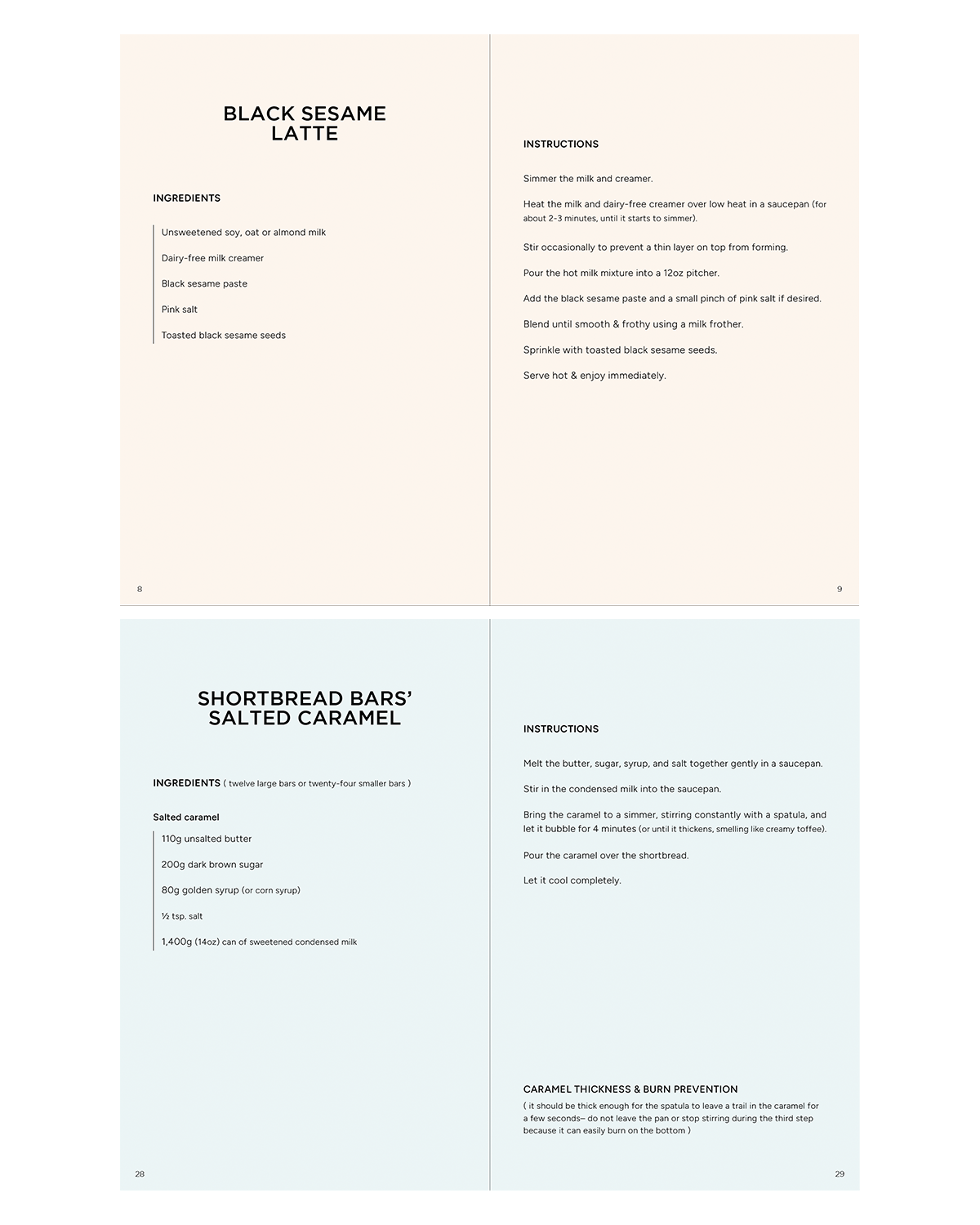
As a final assignment for our Becoming course, we were free to design our own personal project– its entirety from concept to visuals being up to us to decide. I decided to create my own recipe booklet, one that is minimalist and illustrated by myself, as one of my aspirations is to open my own cafe someday. Another thing to note, is that the selection and combination of drinks, as well as desserts, were specifically chosen according to the season and its taste. From a refreshing drink that is perfectly refreshing on a hot summer day, to a warm latte that would comfort one on a cold winter afternoon– there are a selection of recipes to follow and choose from.
Roles
As a graphic designer, my roles were the following:
- come up with a creative idea that aligns with my own personal interest / passion
- design its content and carefully select the correct recipe for each season
- apply what I've learned, such as layout design, typography, etc.
Challenges
These included the following:
- finding what drinks pair well with what desserts
- making sure that the chosen combinations align with its specific season
- finding good, simple recipes that have many positive reviews
- choosing the typefaces
- coming up with each season's title / keywords and ensuring that it's original, precise & concise
- illustrating the drinks & desserts, as this is not really my strong point
- just like many print designs, ensuring that if printed, the page numbers are adequate (divisible by 4)
Solutions
How I managed to complete my project:
- with time and patience
- consulting many reputable recipe / baking websites
- looking up combinations of typefaces online, as well as referring to online templates
- making a moodboard for each season, with images and keywords that represent them well
- referring to images online, and drawing sketches of each before inputting them on Adobe Fresco
- making a draft of the booklet, determining where & how it is all placed, and how many pages it takes
Process
My design process is the following:
- brainstorming drink & dessert recipes that are highly appreciated and sought out for
- making a moodboard for each season, which includes the colour palette, recipes, keywords, etc.
- finding combination of typefaces that align with my minimalist design style
- determining the layout and writing out all the recipes, including the ingredients and instructions
- looking up images of the chosen drinks and desserts for inspiration
- sketching them on paper, then importing them on Fresco in order to draw them using a vector brush
- illustrating some minimalist graphics for each season's spread + cover pages
- finalizing the InDesign file, ensuring that the page numbers are present and correct for print
Results
As this project has only recently been submitted, I did not get the chance to receive any feedback on it. However, when I did bring up my idea and how I intended on designing it, I was given the 'ok' to go ahead that was followed by a head nod in approval.
Personally, I am quite satisfied with my recipe booklet, however I know that my illustration skills must be worked on– as it is a design skill that I do not use quite as often as the others.
Key Learnings
From this project, the insights that I gained are the following:
- A well-thought-out & structured layout allows its viewers to intuitively follow the recipe from ingredients to instructions without jumping around the page.
- Balance aesthetic with function, as the graphic elements should not disturb the white space– additionally, the illustrations not only serve as aesthetics but for visual purposes as well, allowing the readers to know what the recipes will clearly be about.